
The High Plains Regional Climate Center is happy to announce that the new web application, Water Deficit Trends, is available for public preview! Users can analyze precipitation trends across the country. View current drought and precipitation data and trends, alongside current drought monitor information and USGS stream flows.
Access Water Deficit Trends here: https://hprcc.unl.edu/wdt/ Click the red question mark for help when you open the application.
Please Note: While we are excited to begin offering access to this new product, the full six month trend window will not be available until September 2022.
Using the Map Interface

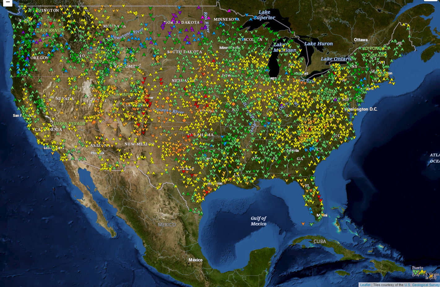
When you first open Water Deficit Trends, you will see a web map with colored shapes, and a side bar with different options. The data points plotted on the map are selected by the “Variables” panel, and the trend range allows you to select a week to compare today’s variable to. For example, by default, the panel has selected the 30 day Standardized Precipitation Index (SPI), and a “Trend Range” of 1 week. This will show the latest 30 day SPI values on the map, and the shape of the point will indicate whether the latest value is greater, less, or the same as the value 1 week ago. This can provide a quick glance at areas that may be experiencing drought improvement! Each data point can be hovered over to see the latest value, and clicking will open the Trend Analysis Panel for the station (more on that below).
The layers panel lists additional layers that may be overlaid. The latest US Drought Monitor may be plotted, rivers, River Forecast Center boundaries, and County Warning Areas are all included!
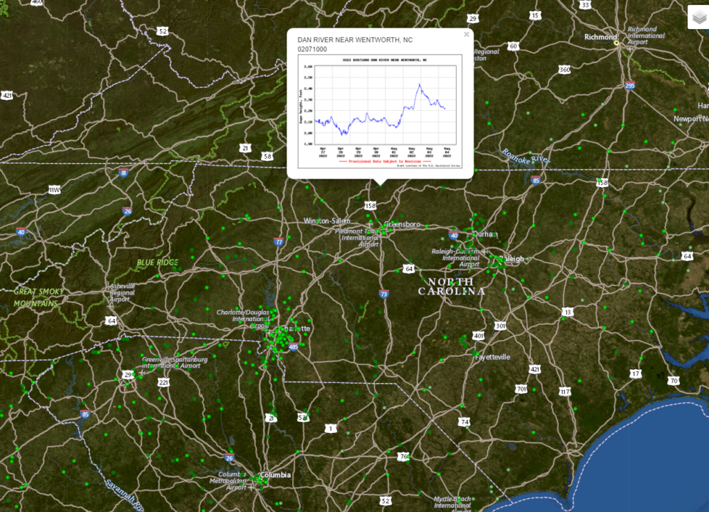
If you select the USGS Gages layer, a dropdown will be displayed which allows you to select a HUC region. All USGS gages with height and/or streamflow will be displayed, with the color estimating the flood stage. Please note that HPRCC provides the flood stage for assistance in analyzing long-range precipitation trends and identifying areas of interest. Accurate information regarding floods can be obtained through the appropriate River Forecast Center.
Clicking a USGS Gage will display a pop-up bubble that shows the station ID and a graph from either the NWS Advanced Hydrologic Prediction Service, or the USGS National Water Information System (The graph can take a few seconds to load). Clicking the graph will open a larger version for USGS plots, or to the station page for AHPS plots.
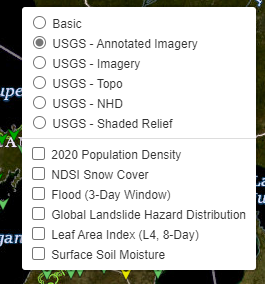
Hovering over the layers icon in the upper-left of the map will reveal additional settings for the map. You can change the base map, or look at some layers provided through NASA’s Earth Observing System Data and Information System.
Trend Analysis Panel
Any data points for the layer you selected in the Variables panel are clickable, and will open the Trend Analysis Panel.
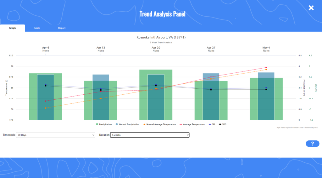
The graph tab shows a weekly graph with average temperature, precipitation, SPI, and SPEI. Each variable plotted is either a 30, 60, or 90 day value depending on the timescale selected in the dropdown at the bottom left of the graph. The Number of weeks dropdown sets the number of weeks displayed on the graph.
At the top of the graph, the date of each week is displayed, with the U.S. Drought Monitor status for that week displayed below the date.
The Table tab shows a data table of the values plotted on the graph. The table can be downloaded as a CSV or printed.
The Report tab shows a printable report with a brief narrative about the timescale and duration selected for the graph, information about the station selected, a weekly data table, a summarization of data from nearby USGS gages for the duration.
Start using Water Deficit Trends here: https://hprcc.unl.edu/wdt/